Chart 1: Obesity Rate by Region (Pie Chart)
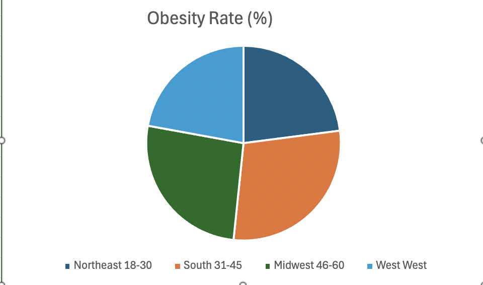
Analysis: The pie chart shows the distribution of obesity rates across regions. The South has the highest obesity rate (35%), while the West has the lowest (27%).
| Region | Age Group | Obesity Rate (%) | Exercise (days/week) | Life Expectancy |
|---|---|---|---|---|
| Northeast | 18-30 | 28 | 4 | 78 |
| South | 31-45 | 35 | 3 | 75 |
| Midwest | 46-60 | 32 | 2.5 | 77 |
| West | 61+ | 27 | 2 | 80 |
Analysis: The pie chart shows the distribution of obesity rates across regions. The South has the highest obesity rate (35%), while the West has the lowest (27%).
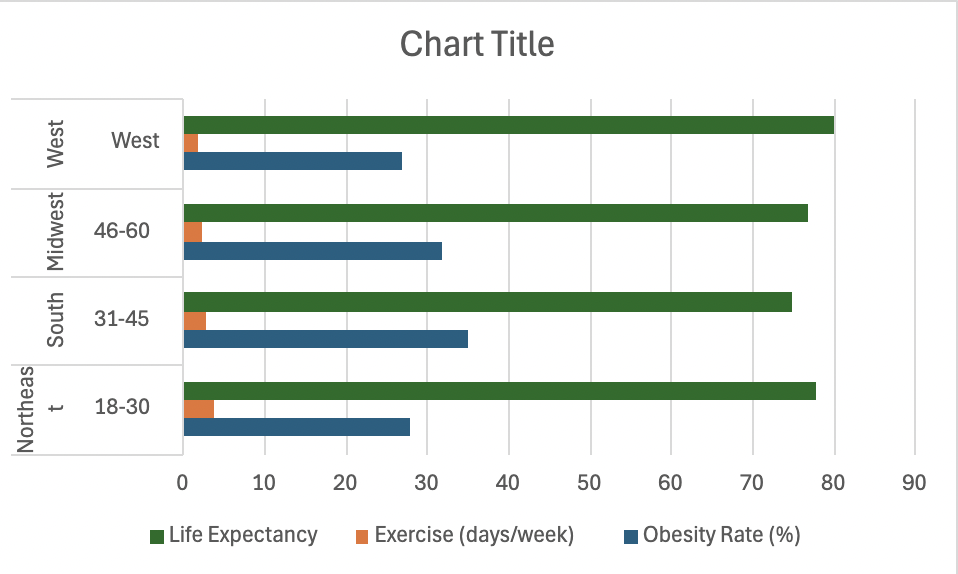
Analysis: This chart compares obesity rates, exercise frequency, and life expectancy across regions. The South has the highest obesity rate and lowest life expectancy, while the West has the lowest obesity rate and highest life expectancy.
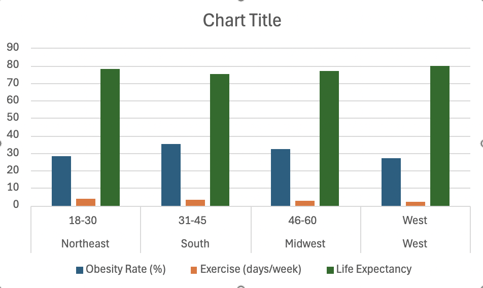
Analysis: The histogram shows the frequency distribution of obesity rates. Most regions fall within the 27-32% range, with the South being an outlier at 35%.